Part 7: Block Styles
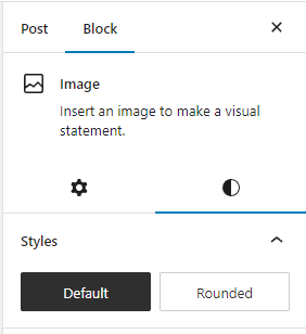
WordPress comes with several Gutenberg blocks that come with minimal CSS. Some blocks have style options like the image block that lets you choose Default or Rounded, or the table block that lets you add stripes. We can easily create new styles ourselves. Let’s start with the table block as the stripes style does not look good for dark themes.
Create a new post or page and add in a table block. I recommend giving it a few columns and at least 5 row. Be sure to enable the header and footer section. If you’re going to style these it’s best to play with the settings so it looks good with every possible setting.
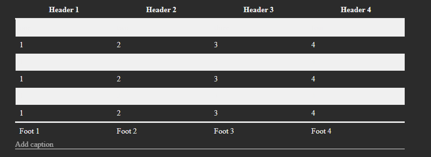
Once you do that, take a look at the style options provided. Enable stripes. If you’ve been following a long and have a dark theme, you’ll see how bad it looks.
I think the developers should have made the odd rows have a black background with a low opacity set. Then it would at least work by default on all themes. We could even just do that ourselves, but that’s no fun. Let’s make a new style instead.
Step 1: Register the Block Styles
Open your functions.php and add the code below. Remember, I like to prefix the function name, and handle, with the theme name. So, you can replace “custom” with your theme name.
// script to register styles
function custom_block_styles() {
    wp_enqueue_script(
        'custom-block-styles',
        get_template_directory_uri() . '/js/block-styles.min.js',
        array( 'wp-blocks', 'wp-dom-ready', 'wp-edit-post' ),
		filemtime( TEMPLATEPATH . '/js/block-styles.min.js' )
    );
}
add_action( 'enqueue_block_editor_assets', 'custom_block_styles' );
On line 5 you’ll see a reference to a file that doesn’t exist yet. If you’re not using a bundler, then rename it so there is no “min” in the filename. Line 6 is the dependency. If you don’t add that, your style will never load.
Create your new JavaScript file in your js folder called block-styles.js.
Open your new block-style.js and add some code to create a new block style for the core/table block.
/**
* Tables
*/
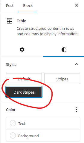
wp.blocks.registerBlockStyle('core/table', {
name: 'dark-stripes',
label: 'Dark Stripes',
});I like to group up all my styles by block type because I typically create more than one style per type.
The first parameter passed into the registerBlockStyle() function is the name of the block that you want to create the style for. All default blocks are prefixed with core. There are no limitations here, you can style any blocks provided by core, the theme, and a plugin.
If you wish to make your style default, you can add isDefault: true to the code above.
Go back to the post you created with your table and refresh. Select the table and you will now see your new style. Select it and save.
Step 2: Enqueue Block Styles (CSS)
You have two options. You can either add your styles to your theme’s CSS file, in which case you can skip to step 3, or you can create a new file for each type and enqueue them separately. I prefer to separate them so we can minimize load time.
Let’s add a helper function to your functions.php file that will enqueue the styles we need without having to copy and paste code over and over.
// load in separate css files for each block type
function custom_block_styles_css() {
	$blocks = ['table'];
	foreach($blocks as $block) {
		wp_enqueue_block_style( "core/$block", array(
			"handle" => "custom-$block",
			"src"    => get_theme_file_uri( "css/blocks/$block.min.css" ),
		) );
	}
}
add_action( 'after_setup_theme', 'custom_block_styles_css' );
This function is only helpful for core blocks of course because of line 5, but that’s fine for now.
On line 3 we have an array. As we create more styles we’ll add to that array. The important thing here is that we use the official names for the blocks. IE: table, list, quote, pullquote, etc…
Now we need to create the CSS file. Let’s create a new folder inside our css folder called “blocks” and inside of that, create your table.scss file. If you’re not using a bundler, just use a regular CSS file and change the filename of the above code on line 7.
Step 3: Adding the CSS
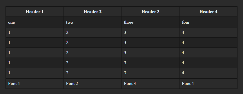
View the post you created on the front-end. If you view the source, you should see the table is wrapped in a <figure> element with the class is-style-dark-stripes. Open up your table.scss file and let’s make it look good.
.wp-block-table.is-style-dark-stripes {
	table {
		thead, tfoot {
			border-color: #141414;
		}
		tbody {
			tr:nth-child(odd) {
				background-color: #222222;
			}
		}
	}
	th, td {
		border-color: #141414;
	}
}
Make sure your bundler is running then save the code. Refresh the page and you should see a nicer version of stripes.
Step 4: Optimize
If you chose to create a CSS file for each block type you plan to style, you might notice that those CSS files load whether you’re using those blocks or not. We can add a very simple line of code that will only load those assets when the block is being used. Add the following code to your functions.php file:
// only load block assets if the block is being used
add_filter( 'should_load_separate_core_block_assets', '__return_true' );
Step 5: List Styles
Let’s create another block style. Lists are something I’ve needed to style in practically every theme I’ve had to build for a client. It also has some quirks, so I feel like it’s a good idea to cover this one.
Open your js/block-styles.js file and let’s register a new style for core/list.
/**
* Lists
*/
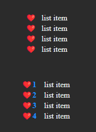
wp.blocks.registerBlockStyle('core/list', {
name: 'hearts',
label: 'Hearts',
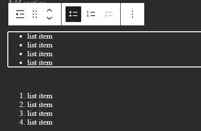
});In the post you created, add a couple of lists. One set to default type, and one a numbered list. Then set both of them to use your new “hearts” style.
Add the ‘list’ to the $blocks array in your functions.php file where you registered the custom block styles css.
Add a new list.scss file to your css/blocks folder. Remember, the file name needs to match the block name. See the sample code below:
ul.is-style-hearts {
	list-style-type: '♥';

	li {
		padding-left: 10px;
	}
}

ol.is-style-hearts {
	li {
		padding-left: 15px;

		&::marker {
			content:  '♥' counter(list-item);
			color: dodgerblue;
			font-weight: bold;
		}
	}
}
We want separate styles for both ul and ol. The reason being is we don’t want to remove the numbers from an ordered list. Line 14 above you’ll see that you can add both an icon and the counter. There are ways to reset the counter in the code as well. We need to avoid doing that because sometimes users will break their ordered lists and start again later in their post.
You have now created one style that works for both types of lists.
Update 2026: WordPress wont let me add real emojis into my code sample. But you can absolutely use them in your code.
That concludes Block Styles!
