Poor Heading Structure
The Review
I recently had to review a WordPress site built by a designer using a theme builder. The guy has been building WordPress sites for several years, as far as I know, and can put together a page in HTML just fine. This WordPress site was supposed to be WCAG 2.1 compliant and I knew there would be issues because he hasn’t been trained on ADA yet. So, I made my new Google Doc and starting reviewing.
The Problem
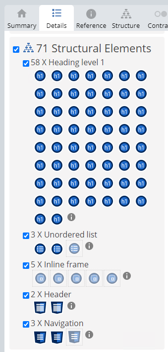
Initially I start off by looking for issues that web tools and scanners can’t find. At this point I have a full page of fixes that need to be completed across this 20-page site, not counting the blogs. Then I decide to open my WAVE plugin. There were 58 <H1>‘s on the page. 58! WHAT?!
I’ve been a developer for almost 30 years. I genuinely forget that not everyone knows everything about HTML. Even if it is the most basic level of development. I expect that anyone who has been in this field for more than a couple years should know HTML very well. Maybe not.
After I took a breath, and chilled-the-heck-out, I started writing notes for him. I provided examples of what headings should be on the page. Then I realized something else… every single piece of text on the page, that wasn’t a button or a nav link, was an <h1>. I looked at all the other pages. Yup, ALL <h1>‘s!

Why does it matter?
Visual Hierarchy
Think of a webpage like a word document. Headings set a structure to a page. Proper headers allow readers to skip to the information they don’t care about without having to read everything.
The best example I can think of is recipe sites. I hate that I have to scroll down so far just to get to the ingredients and directions. I notice a trend of 10 or so completely pointless paragraphs, saying the same thing over-and-over with different wordings, with images of the recipe in between. Images that, oddly enough, look exactly the same as the one before it.
When headings are properly set, we can skip all the garbage!
Screen Readers
In regard to WCAG, Section 508, ADA, whatever you want to call it; screen reader users can tab through various elements like landmarks, navigation/links, and headings to get to important information. If there’s a lot of content, and no headings, they have to read through the all the content. Who has time for that? Seriously.
Likewise, if the entire page is <h1>’s, that’s just as unhelpful.
SEO
I worked with a border-line black hat SEO company for a few years that loved to add keywords into headings when it made no sense. Google uses headings to understand your content, but it doesn’t really help or hurt your rankings anymore. Instead, what it does affect, is your bounce rate. This is where visual hierarchy comes in to play. If a user comes to a page and sees a wall-of-text they will likely just leave.
Headings are important. They don’t take too much thought, but do treat them with care.
