Part 4: Deep Dive into WordPress Styles
Previously we created the theme.json file which allowed us to set up some default colors and styles for the site as a whole. We can also set some default styles for each of the block types. And once we’ve done that, we can create a whole new json file and create a brand new set of styles for the user to pick from.
At the very top of your json file there should be a property for "$schema" and its value set to "https://schemas.wp.org/trunk/theme.json". This allows your editor, at least VSCode, to aid you in selecting the correct json properties.
Aside from the $schema, there are 7 top level properties: version, which is currently set to 2, title, settings, styles, customTemplates, templateParts, and patterns. See the sample below:
{
	"$schema": "https://schemas.wp.org/trunk/theme.json",
    "version": 2,
	"title": "",
    "settings": {},
    "styles": {},
    "customTemplates": [],
    "templateParts": [],
    "patterns": []
}
Tip: To find all the properties you should be able to start a new line and type the quotation marks. The code editor should list all available properties that you haven’t already used.
Settings
In Part 1 we turned on appearanceTools, which gave the user a lot more options out of the box for all blocks. We also added layout options, and a color palette. We can also add custom duotone options, both linear and radial gradients, specific font families, enable margin & padding options as well as specify which units can be selected. For example, px, em or %. Here’s a sample I’ve put together for the settings property.
"settings": {
	"appearanceTools": true,
	"layout": {
		"contentSize": "800px",
		"wideSize": "1200px"
	},
	"color": {
		"palette": [
			{
				"name": "Dark",
				"slug": "dark",
				"color": "#2b2b2b"
			},
			{
				"name": "Light",
				"slug": "light",
				"color": "#efefef"
			},
			{
				"name": "Green",
				"slug": "green",
				"color": "#1D594E"
			},
			{
				"name": "Yellow",
				"slug": "yellow",
				"color": "#F2CB05"
			},
			{
				"name": "Yellow Orange",
				"slug": "yellow-orange",
				"color": "#F29F05"
			},
			{
				"name": "Orange",
				"slug": "orange",
				"color": "#F28705"
			},
			{
				"name": "Red",
				"slug": "red",
				"color": "#F23030"
			}
		],
		"duotone": [
			{
				"colors": [
					"#ff0099",
					"#000"
				],
				"slug": "pink-and-black",
				"name": "Pink and Black"
			},
			{
				"colors": [
					"yellow",
					"#000"
				],
				"slug": "yellow-and-black",
				"name": "Yellow and Black"
			}
		],
		"gradients": [
			{
				"slug": "hot-pink",
				"gradient": "linear-gradient(30deg,#ff0099 0%, #000 100%)",
				"name": "Hot Pink"
			},
			{
				"slug": "fun-yellow",
				"gradient": "linear-gradient(180deg,yellow 0%,black 100%)",
				"name": "Fun Yellow"
			}
		]
	},
	"typography": {
		"fontFamilies": [
			{
				"fontFamily": "Georgia,sans-serif",
				"slug": "georgia",
				"name": "Georgia"
			},
			{
				"fontFamily": ""Courier New",monospace",
				"slug": "mono",
				"name": "Courier New"
			}
		]
	},
	"spacing": {
		"margin": true,
		"padding": true,
		"blockGap": true,
		"units": [
			"px",
			"em",
			"rem",
			"vh",
			"vw",
			"%"
		]
	},
	"custom": {
		"line-height": {
			"body": 1.7,
			"heading": 1.2
		}
	}
},
If you take a look at the default “twentytwentythree” theme you can see how they are loading in fonts from the file system, so you don’t have to just use the standards.
Styles
These options determine how blocks will actually appear by default. In Part 1 we set the default background, text and link colors. The number of options we have here are many. You’ll definitely want to take advantage of the schema helper.
There is one very helpful property and that is the styles.css property that allows you to enter any custom CSS that may not be covered in the options. See the example below:
"styles": {
	"css": "body{color: chartreuse;}"
}
Below you will find a sample I put together that includes everything we did it Part 1 with some additions. I’ve added some default button styles that show how to also set hover, focus, active and visited styles. You can set those on links as well. There’s a very helpful setting for blockGap that auto adds spacing between blocks. Then there’s the crazy part; specific block styles. Once you’re happy with all the styles for the site as a whole, you can specify blocks and add the same style options to each of those.
"styles": {
	"color": {
		"background": "var(--wp--preset--color--dark)",
		"text": "var(--wp--preset--color--light)"
	},
	"elements": {
		"link": {
			"color": {
				"text": "var(--wp--preset--color--yellow)"
			},
			":hover": {
				"color": {
					"text": "var(--wp--preset--color--yellow-orange)"
				}
			}
		},
		"button": {
			"border": {
				"radius": "5px"
			},
			"color": {
				"background": "yellow",
				"text": "black"
			},
			":hover": {
				"color": {
					"background": "red"
				}
			},
			":focus": {
				"color": {
					"background": "orange"
				}
			},
			":active": {
				"color": {
					"background": "green"
				}
			},
			":visited": {
				"color": {
					"background": "purple"
				}
			}
		},
		"h1": {
			"color": {
				"text": "dodgerblue"
			}
		}
	},
	"spacing": {
		"blockGap": "50px"
	},
	"blocks": {
		"core/group": {
			"spacing": {
				"padding": {
					"top": "0",
					"right": "15px",
					"bottom": "0",
					"left": "15px"
				}
			}
		}
	}
},
The above settings aren’t the most beautiful options, but it helps when figuring out exactly what the settings are doing. If you’ve been using Gutenberg before they released this theme.json file, then you’ll understand just how many hours of work this will save. If you’re unfamiliar, trust me. This new feature is a Godsend.
Extra Styles
WordPress has allowed us to create more styles for the end-user to choose. When the user is customizing their site, they can select from a list of colors, fonts, borders and so on, that you have put together. They can then change them as they see fit. Start by creating a new folder called “styles” inside your theme folder. Inside of that folder create a file named blue.json, or whatever you want to call it. You can copy the two samples below if you wish.
Anything not specified in these files will be pulled from the original theme.json file.
{
	"$schema": "https://schemas.wp.org/trunk/theme.json",
    "version": 2,
	"title": "Blue",
    "settings": {
		"color": {
			"palette": [
				{
					"color": "blue",
					"name": "Blue",
					"slug": "blue"
				},
				{
					"color": "aquamarine",
					"name": "Aqua",
					"slug": "aquamarine"
				}
			]
		}
	},
    "styles": {
		"color": {
			"background": "blue",
			"text": "white"
		}
	}
}
{
"$schema": "https://schemas.wp.org/trunk/theme.json",
"version": 2,
"title": "Green",
"settings": {
"color": {
"palette": [
{
"color": "red",
"name": "red",
"slug": "red"
},
{
"color": "yellow",
"name": "yellow",
"slug": "yellow"
},
{
"color": "blue",
"name": "blue",
"slug": "blue"
},
{
"color": "green",
"name": "Green",
"slug": "green"
},
{
"color": "orange",
"name": "Orange",
"slug": "orange"
}
]
}
},
"styles": {
"color": {
"background": "green",
"text": "white"
}
}
}Previewing your styles
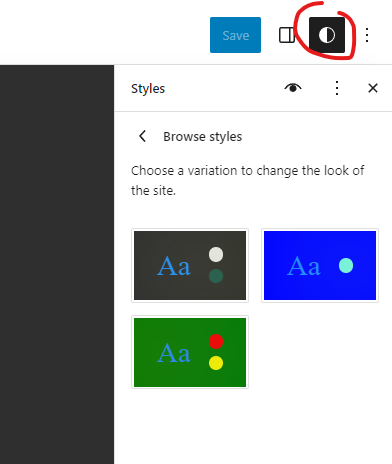
- From the admin panel navigate to Appearance > Editor.
- Click anywhere in the preview pane on the right side.
- A new panel should appear on the right. Click the circle styles icon that is half black and half white.
- A new menu will appear on the right side. Click “Browse styles.”
- Select one of the new styles you’ve just created.
Note: If you make changes to your new json files, you will have to navigate back here, and re-select to see changes.
You are not limited to just changing the colors here. You can do ANYTHING! Add borders, change font sizes, font families, add cool gradients. Whatever you want. I hope you enjoy this new power. If you create any themes please comment below. We’d love to see them!
